Whatever the size of your home, you’ll want every centimetre to work as hard as possible. This is especially true when space is limited where it really is about thinking big in small spaces in order to maximise your home. I really enjoyed helping a client renovate a tiny apartment in Dublin earlier this year. At just over 40 square meters, it measured less than the new minimum apartment size. A shoebox, some might say. But with a few tactical alterations and careful choice of finishes and furnishings, we created a light-filled, elegant space. Let’s walk first of all through the apartment as it was before we started the work.
BEFORE PHOTOS
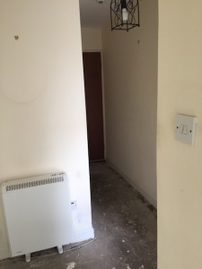
- HALL
- HALL
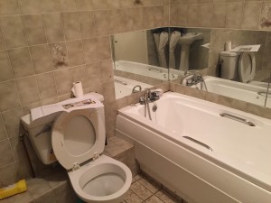
- BATHROOM
- BATHROOM
- KITCHEN
- LIVING AREA
- BEDROOM
- BEDROOM
SOME COMMENTS…
- OVERALL the apartment had great character, being in a red brick building designed by the late Sam Stephenson. Being on the second floor, it enjoyed great light.
- HALL: a long, winding space with too many doors (including a door opening into it from the living room).
- BATHROOM: a relatively large, dull room with too much beige, too much tiling, too much ducting and an ugly bath.
- KITCHEN: a dark space, isolated from the rest of the room with too many corners.
- LIVING ROOM: dominated by a storage heater and hampered by not being able to put the sofa opposite the fireplace due to the the position of door to the hall.
- BEDROOM: minimal wardrobe space with an unattractive bed position facing the door.
BEFORE & AFTER PLANS AND KEY ALTERATIONS…
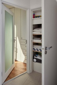
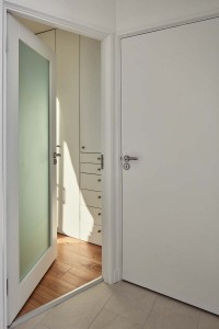
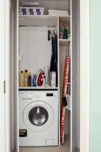
- HALL: We “borrowed” space from the over-large bathroom to create a laundry cupboard in the hall. This is 90 cm wide and comprises, on one side, a counter over a washer/dryer. A hanging rail 120 cm above this provides useful hanging, with shelves overhead for little used items. A tall slot alongside this arrangement provides a home for the ironing board and brooms.
- BATHROOM: We created instead a shower room with a 90 x 90 cm shower in a new alcove created by the laundry cupboard. A wall hung-toilet and wash basin were placed side by side on the opposite wall. The 15 cm recess created by the concealed cistern for the wall-hung toilet was used to create handy, hidden storage the full width of the wall. The mirrored doors to this storage conceal adjustable shelving and create the illusion of a larger space. The wash basin also has storage drawers under.
- HOT PRESS: every possible recess in this space was shelved out with slatted shelves spaced 25 cm apart.
- LIVING ROOM: The door to this room was re-located from the slanted to the straight part of the wall nearest the kitchen. This allowed the door to open into the room as opposed to into the hall, its location also meaning that you arrive now in the dining area. A tall, electric stove was provided instead of the open fire, bringing both elegance and a more energy efficient focal point to the room. As the fire is asymmetrical on the chimney breast, the television was placed alongside the stove, resolving the age-old conflict between the two.
- KITCHEN: the units were re-organised into an “L” shape, leaving only one corner (always problematic in a kitchen). The units are in sprayed mdf, with adjustable shelves at an upper level and pull out units below counter.
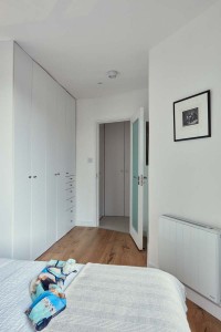
- BEDROOM: Once again, we “borrowed” space from the hall, incorporating a former cloaks cupboard into the room. This allowed us to create a long run of simple wardrobes in the space before the bed, forming a dressing area. The bed, incorporating storage drawers, was rotated to face the window, altogether a more pleasant place to wake in the morning.
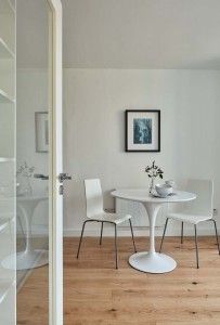
- FINISHES: a simple palette of floor finishes was used throughout, with oak boards in the living and bedroom areas and white terrazzo style tiles in the hall, bathroom and kitchen. The walls are white with art works chosen and located to add colour at key points. The table and couch are modest, to fit best with the scale of the space. Track lighting and spotlights were used as an alternative to recessed downlighters.
- Hall.
- Hot Press closed.
- Hall towards living, laundry open.
- Hall towards living, laundry closed.
- Hallway towards bedroom.
- Bedroom towards bed.
- Bedroom with under-bed storage
- Bed faces terrace.
- Bedroom towards dressing area.
- Laundry.
- Shower and towel rail.
- Bathroom storage,
- Kitchen sink and hanging rail.
- Dining Table and stove.
- Bathroom art.
- Dining area from hall.
- Kitchen Dining.
- Living Room towards kitchen.
Take a tour of the apartment on Houzz.


