Before and after photos show how a smart layout and ingenious design turned a dark space into a bright, welcoming home

Amanda Pollard 12 August 2018
Being a professional house hunter, Breffnie O’Kelly knew this was the perfect house for herself and her teenage daughter – it was close to the school and nearby walks, the road and neighbours were nice, and the house itself had bags of character.
The catch? The inside was dreary and cramped. So Breffnie called on the expertise of architect Eva Byrne of Houseology to make her new home feel light, airy and spacious.
House at a Glance
Who lives here Professional property hunter Breffnie O’Kelly and her teenage daughter
Location Dublin, Ireland
Property Early 20th century terraced house
Size Two bedrooms and one bathroom (55 sq m)
Architect Eva Byrne of Houseology Photos by Philip Lauterbach
Everything about this two-up, two-down cottage said ‘good buy’ to Breffnie O’Kelly and her teenage daughter when they spotted it – everything, that is, except the dark and dreary internal layout.
Luckily, Breffnie could call upon her friend, architect Eva Byrne, to help her with some ideas. “I also work as a house consultant, so this started out as a consultation,” says Eva.
But it wasn’t long before she’d come up with a complete redesign of the property, and Breffnie had commissioned Eva to take on the full project.
At the front of the property, Eva replaced the windows and door and took down the modern railing that surrounded the flowerbed. “We fitted a timber door in a welcoming colour,” she says.

The front door opened straight into the living room, so Eva decided to create a separate hallway.

We fitted a painted timber and glass screen that can fold all the way back,” Eva says. “It gives you privacy from the street when you’re in the living room.“You don’t do anything near the door anyway, so you’re not losing any living space by adding a division,” she adds.
The team put in a ledge with hooks underneath and a round mirror to turn the space into a useful hallway.


The stairs to the right of the door were extended right along to the glazed partition. “It makes the room feel wider,” Eva says. They also painted on a grey runner, which leads you up the steps.
Rather than leave the back of the front door white, Eva chose to add colour. “We painted the door the same shade on both sides to make a feature of it,” she says. “In white, it wouldn’t have worked as well.”
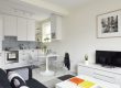
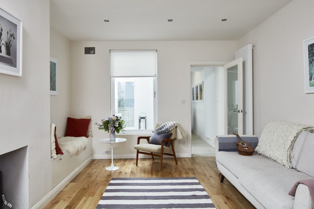
The living room has a simple yet cosy feel, with white walls, recessed spotlights, a soft rug and a comfortable sofa. “The sofa is a neat 180cm wide,” says Eva. “It’s important to size furniture appropriately, so it doesn’t take over the room.”

Eva kept the fireplace minimal, too, with a flush hearth and a plain opening for the wood-burning stove. Storage was built into the chimney alcoves – there’s a bookcase and cabinet to the left.

To the right of the chimney, the team built a bench seat with storage drawers below.

The seat is positioned next to a window, which Eva had lowered to maximise the view of the courtyard and bring plenty of light into the room.
She chose some botanical prints for the walls to further connect the inside with the outside space.
The ‘before’ photo of the living room shows how much darker it was before the window was lowered.


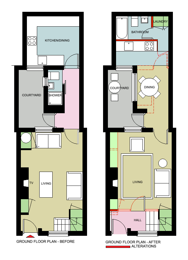
The key to creating a luminous and spacious feel was to connect the living spaces to the courtyard at the centre of the property.
The existing floor plan shows how a shower room was blocking the view. Eva removed it and located an open-plan kitchen-diner in its place, then tucked a bathroom at the back of the property.
A glazed door leads from the living room to the new kitchen-diner. The glass is opaque to allow light in while creating privacy between the two areas.
“As Breffnie’s daughter is a teenager, we thought it was important for her to have her own space,” says Eva. So her design takes into account a separation of each area of the house, so that mother and daughter can enjoy time together and apart.
The shower room had previously blocked access to the courtyard.

Dining – Before 
Dining – After
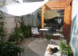
Just before you reach the dining area, there’s a glazed door to the courtyard. The large window next to the table can’t be opened, but it helps to bring light and a spacious feel into the home.
Porcelain tiles have been laid on the floor both inside and on the patio to further connect the two areas.
“We wanted the table to have a single leg so you can sit anywhere around it,” says Eva. “Our carpenter made it from a table base and a circle of MDF.”

A row of narrow picture ledges provides enough room for books without encroaching too much on the space.

The previous kitchen took up the entire back room of the house.

Kitchen – Before 
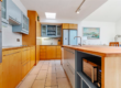
Kitchen – After
The new kitchen is a simple design with painted MDF doors, but Eva used a clever trick to increase storage. “We chose to make the worktop 1m high instead of 90cm,” she says. “This allowed us to fit slim drawers along the top. It’s a sneaky way of getting more from the kitchen, and it works well here, as my friend is quite tall.”
There was already a rooflight in the space, and Eva maximised the brightness by choosing a quartz worktop and glass tiles for the splashback. “These were remnants from a discontinued line, which is a good way to save money,” she says.
Another smart design idea allowed Eva to fit a bathroom and utility room into the space. The units are located along a partition wall that sits 135cm away from the original back wall. The full-height door on the right of the cabinets looks like a tall unit, but is in fact a door to the room behind.


Through this door is a laundry area and bathroom. “There’s a tall cupboard in here with a washer and dryer, and this leads to the bath area,” says Eva.
“My client really wanted to fit in a bath, which threw me slightly in such a small space,” Eva laughs, but it didn’t take long for her to come up with a plan. By moving the kitchen 135cm forward, she had created enough space to fit a small bath perfectly.

“We used white in here and lots of mirror, so it doesn’t feel small,” she adds. “We put two shallow Ikea cabinets side by side for storage. With bathroom storage, you only need a cabinet deep enough to fit a toilet roll.”
In the front bedroom, there was an original cast-iron fireplace, which Eva decided to highlight as a feature. She lined up a patterned runner in front of it and positioned a vintage piece of art, which the owner had inherited from her grandmother, above it.


Slim, wall-mounted shelves in place of a bedside table save space, while a picture ledge above provides a surface for books. Opposite and out of shot is a 44cm deep wardrobe from Ikea. “It’s a good option if you don’t have a lot of space,” Eva says.