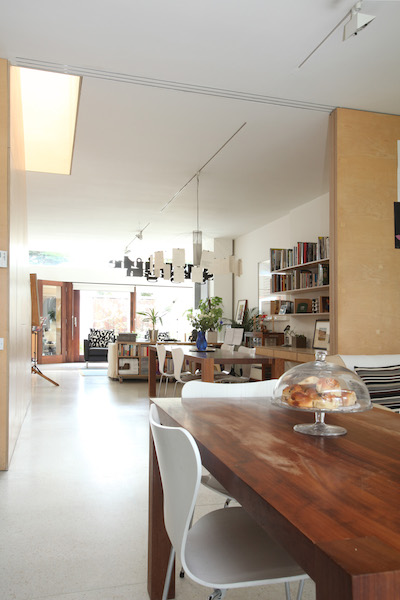
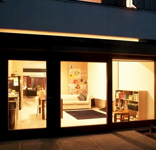
Your kitchen may be part of an open-plan Kitchen Dining Living Room or a separate room. In either case, you’ll need to balance your wish-list with the space that’s actually available to find the best kitchen design ideas for your home.
KITCHEN DESIGN
- FIND YOUR BLANK CANVAS: When starting from scratch, find a way to imagine the space as a blank space. Clear away, in your mind, any units that are there. Don’t get bogged down with matters of plumbing, electrics and radiators. The cleared space is your Blank Canvas.
- BRAINSTORM: Think about all the possible places where the kitchen units could be placed. Consider also those solutions which you think won’t work! You may gain a fresh perspective on the possibilities for the kitchen design.
- CONTEXT: Look for balance of space-use between the kitchen units and the overall space. For example, our kitchen storage capacity is geared towards a weekly shop. We do not have 6 months survival rations and an encyclopaedic larder.
- THINK SINK: Do not assume that the sink has to remain in its traditional position at a window. Where possible, I try to keep kitchen units away from the windows. This has the powerful effect of making the space seem bigger. It also allows for a better flow of light. The space can seem “entrapped” when the windows are blocked by kitchen units. Keeping the windows free of units can also improve the relationship between the room and the garden.
- THE OLD TRIANGLE: Don’t follow slavishly the traditional advice that the sink, cooker and fridge should form a triangle. Ours’ are in a straight line – sink and fridge either side of a range cooker – which works well functionally, aesthetically and spatially. It is a flattened triangle.
- CUT CORNERS: Try to avoid corners, where possible. While improvements have been made in the design of corner cupboards, they are not an optimal solution.
- MAXIMISE LIGHT: Keep taller units like the fridge, larder, eye level oven, away from windows. This will minimise their impact on light.
- LOVE ISLAND: Be wary of the desire to provide an island unit at all costs. I think islands really some spaces and some room layouts, but not all. For example, an island would fit easily in our kitchen. But it would destroy the balance of space as a whole and make the kitchen more dominant in the house than we wish.
- SCALE UP: Consider making the units full height, that is, up to the ceiling. This upper level cupboard space is always useful for those items not in everyday use. Plus, you avoid a nasty dust collecting surface at the top of the cupboards.
- DRAWERS: Provide drawers, not cupboards, to all low level units. Scrambling to reach things at the back of cupboards is no longer necessary! Consider also a dishwasher with drawers as opposed to a pull down door.
- ADJUSTABILITY: Provide adjustable shelving to all cupboards where possible and especially where the kitchen size is restricted. This will allow for optimal use of every centimetre available.
- SSHHHH: Provide an inline fan to the extractor system where possible. This entails locating the fan remotely from the point of extract, thereby minimising noise when the fan is in use. Less noise means you will be more inclined to use the fan with a resulting reduction in smells and condensation.
- WASTE NOT: Give thought to managing waster disposal and recycling. Nowadays, we need 3 part bins, one section each for brown, black and green bins.
- EVICT THE WASHING MACHINE: Small kitchens require extra attention, with space at an obvious premium. Consider if the washing machine can be accommodated elsewhere to free up valuable space. Possible alternative locations include under the stairs or in the bathroom.
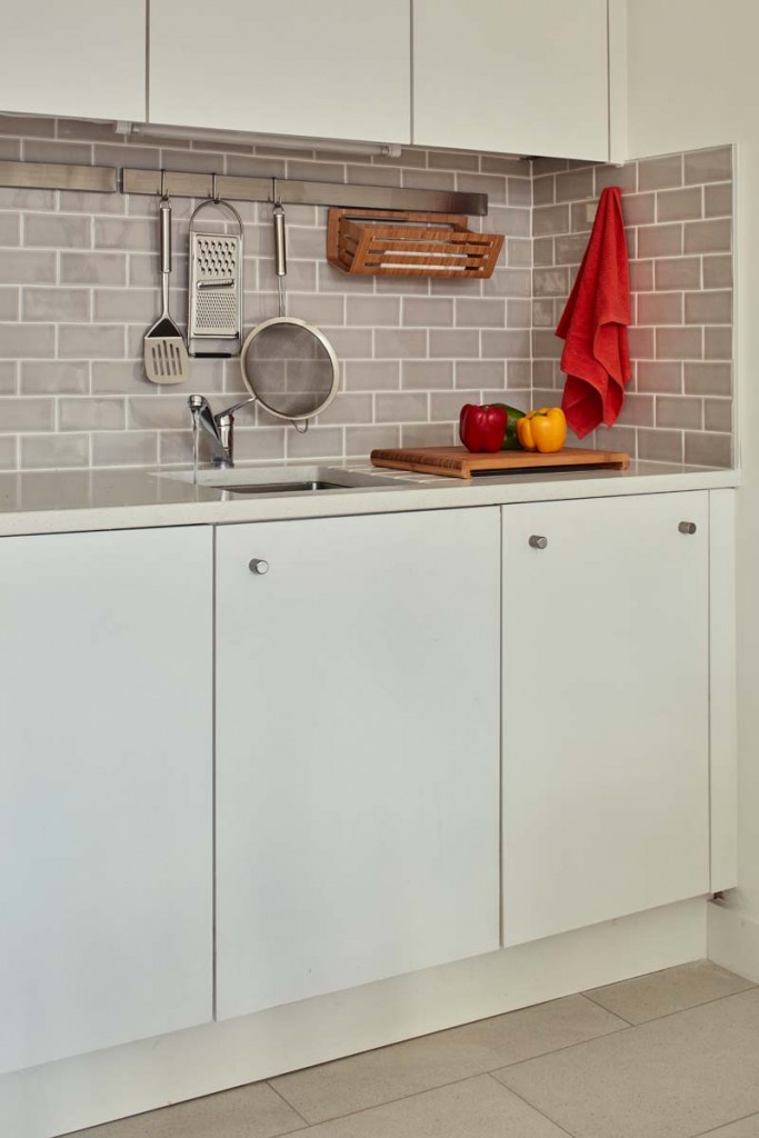
- A straight run of units at lower level measures 5.8m in length with, from left to right, mobile bin, dishwasher, sink preparation area, range cooker, second preparation area, American fridge.
- Custom made cupboards at the upper level are of birch ply.
- The sink and preparation area are freestanding pieces from the system 20 range from bulthaup. This is a flexible, mobile, universally useable system that can be extended as much as you wish and which is designed to move house with you.
- Each of the two pieces measures 130cm x 70cm x 95cm high.
- The sink element is so well designed that it is the only area we use – and need – for food preparation with the table providing useful back-up when necessary. It is an essay in intelligent, ergonomic design.
- The large stainless steel sink has two flat draining areas either side and comes with a suite of sliding chopping boards and multi-functional sink inset pieces.
- The bulthaup bin is similarly thoughtfully designed, with a hinged flip up lid revealing 3 removeable caddy insets. A large drawer below is useful for larger items awaiting recycling like newspapers and cereal boxes.
- FAN: We didn’t provide an inline fan!
- TAP: The fixed tap does not reach the farthest reaches of the large sink, a detachable, flexible nozzle would solve this issue.
- DISHWASHER: I look forward to getting a drawer dishwasher. Our current dishwasher has broken down and is being used to house the poinsettias by night to make them flower at Christmas…
Read more houseology Kitchen Design Ideas on Houzz & The Sunday Independent…
- Houzz: Ten Essential Kitchen Dimensions You Need to Know.
- Houzz: How to Design a Kitchen that’s Easy to Clean.
- Houzz: Ten Big Ideas for Brightening a Dark Kitchen
- Houzz: Small Kitchen Ideas to Steal from Our Tours.
- Houzz: The Key Dimensions to Know When Designing Storage
- Sunday Independent: Should I go for Wall-Hung Units?


